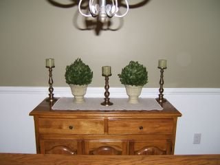
This is probably the most ridiculous post in the history of blogging but, here goes. Please tell me which arrangement of candlesticks looks the best. I usually drag my sister over to help me with this sort of thing but if I dragged her for nine hours, I would be a little tired. har-har
Option A
Option B
Option C
I bought these candlesticks at Target, they were on clearance and I just loved them. I have those other plants (fake, of course) that I would like to use in the dining room, too. I am in a quandry. The buffet seems to be lacking something, maybe a more colorful fabric runner? I already tried a Paul Klee framed print over the buffet but it didn't look right. That chandelier is huge and makes anything on that wall look garish.
What's a girl to do??
Help!
April 6, 2006
Opinions?
Subscribe to:
Post Comments (Atom)


18 comments:
Alright! I like "B" also!!
I like B.
No good explanation for it, though.
I've been meaning to tell you how much I loved Wit. I adore Emma Thompson, and the subject is so fitting for what we all are going through right now. My husband and I cried all night over the movie them promptly bought a copy to share with the rest of the family. I also bought the play in book form.
I think of you when I take it off the shelf (often, to re-read some of the lines) and I am so thankful that you recommended it.
Crissy
I like "B"
Staci
I happen to like any arrangement with a Veggi-tale theme; so they all look good to me.
Laney, can I offer a third option? I'm not a fan of symmetry (much to my husband's dismay), so I would stack a coule of pretty books on one end of the server, and put one plant on the books and the other on the server next to it. Then I would cluster the candles on the other end of the server.
Ignore me if you are symmetry kind of gal! Then I would also go with B.
-Amy
I like Option B too.
coming out of lurkdom for this most important request
My vote is for B.
Option B!
I was going to say something similar to Amy's suggestion. My house just isn't formal enough to call for that much symmetry. I'd go for a more asymetrical look - books on one end, or a framed picture w/ the candlesticks around/behind it. Break it up a little.
But, the pictures did make me sit up straighter... ;-)
Dy
Bee.
I like them all, so I can't help. I hope you figure out what to do! Sorry...
I like B
Plan B, definitely!
I am with Amy and Dy, and if you don't like that, I would go with B. I also think you need somethng on that wall. Maybe not Paul Klee, but something. Maybe something painted by a boy, and framed?
LB
Of the three options, I like B. But I agree that maybe it is too symmetrical. Maybe you could move one of the plants to another place in the room and replace it with something else. I personally wouldn't do books in a dining room--maybe a pretty bowl with fruit. For the wall, how about a collection of black and white photos in matching frames? By the way, your house looks lovely!
Another vote for "B" although I am intrigued by the idea of going assymetrical and maybe bunching the plants on one side or something. You could even put one of the plants on a little block or something to give it some height.
B for me too, looks more "fung shui" (I know I botched the spelling).
Asymmetrical would give me hives! ;-)
In my house it would be option D, thrown on the floor and smashed. And the dirt making inside sand castles... *sigh*
I own NOTHING nice. ;-)
I vote for option B.
Post a Comment